Purpose of BI
What are Business Intelligence Reports and Why Should We Use Them?
Business Intelligence reports are Avail's robust reporting mechanism provided to all agencies; included with your ITS system. Many BI reports are directly populated by data collection from vehicles. For this reason, vehicle login is essential, and in fact, it is required. Agencies can leverage these reports to determine any needs. Focus on three areas when reviewing your data metrics. Then formulate any follow- up action plans.
Focus Areas:
-
Digital Schedule
- Is the schedule realistic? Can it be achieved on the road? Do you see trends with consistent extreme lates, earlies? This can often point to schedule data refinements for your planning team.
- Drive and dwell times should be well-balanced. This optimizes your vehicle cycles and ensures vehicle operators experience less stress on the road.
-
Vehicle Operator Behavior
- Do you see issues with late or missed MDT logins and missed MDT log outs?
- Early departure trends?
- Deviations from scheduled routes unrelated to detours?
-
Vehicle Health
- Are vehicles in good health and reporting consistently?
- Leverage APC reports in the Planning reports area. Filter on vehicles to find out if all vehicles are reporting accurately.
Avail’s Business Intelligence (BI) contains a variety of visualizations ( charts and graphs). This article details two common types of reports:
- Overview dashboards that have a group of visualizations about a common topic.
- An individual visualization on a tabbed page.
Let's cover their basic configurations and functionality. Later articles show how to interact with them.
Overview Dashboards
Overview dashboards combine multiple visualizations on one screen. An example is below. These dashboards use a variety of related visualizations to illustrate a common theme. Individual visualizations ( bar graphs, scatter plots, charts- that assist with interpreting the information). These appear in a combination overview are usually available as a standalone report elsewhere in Business Intelligence. These overview pages simply pull related visualizations together into one dashboard to tell a story about a topic.
Examples of combined reports include the following:
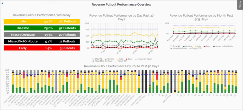
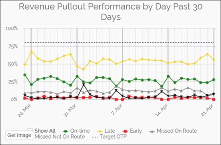
- Revenue Pullout Performance Overview
- On-time Performance Overview
- Operation’s Event Dashboard
Below is the Revenue Pullout Performance Overview. This report illustrates operator logins as connected to performing revenue service. Login is essential as it connects the vehicle to its piece of work. Login begins data collection against the digital schedule. 'MissedNotonRoute' reporting tells us the vehicle is not collecting data against the schedule. 'MissedonRoute' tells us the vehicle logged in after the scheduled time, meaning deadhead time is not reported against the scheduled expectation. Use this report to ensure all operators log on at the start of their shift/ drive time to capture all reportable data correctly.
For some of these overviews, you can click on a visualization to go to the individual tabbed page for that report.
You can also use the Filter slide out panel to filter your data. Click the Filter tab on the top-right to expand the filter panel. For combination overview dashboards, filtering works similarly to the individual charts, except that the filters apply to all the charts in the combination display. To determine whether BI is filtering your data, click Filter and look for active filters.
For more details about filtering data, read Filtering Your Data with the Filter Panel.
Anatomy of a Tabbed Visualization Page
If you are not looking at an overview dashboard, you are probably looking at an individual chart in a tabbed display. These tabbed visualization pages have a common design and typically display bar charts or line charts. The type of visualization that appears on each page depends on the characteristics of the underlying data.
Typically, the best strategy for using BI to answer your business questions is to identify the outcome variable that your query relates to, and then find the visualization that displays that variable. All charts in Avail’s Business Intelligence display outcome variables on the vertical axis. After identifying the correct visualization, you can change the grouping variable along the horizontal axis to suit your needs.
On tabbed visualization pages, you can choose the variable that displays across the graph’s horizontal axis. For some reports, you can also change the outcome variable.
- If there is a drop-down list at the top, you can change the outcome variable that displays on the vertical Other tabbed pages have this option in the filter panel.
- Click the tabs across the top of the chart to change the horizontal
In the screenshot of the Farebox & APC Analysis below, the numbers correspond to the options above. On this chart, the outcome variable on the vertical axis is ridership, and ridership numbers are grouped by route on the horizontal axis. Use this configuration to understand how ridership count varies by route. Click different tabs to see how ridership varies by other aspects, such as block, fare, etc.
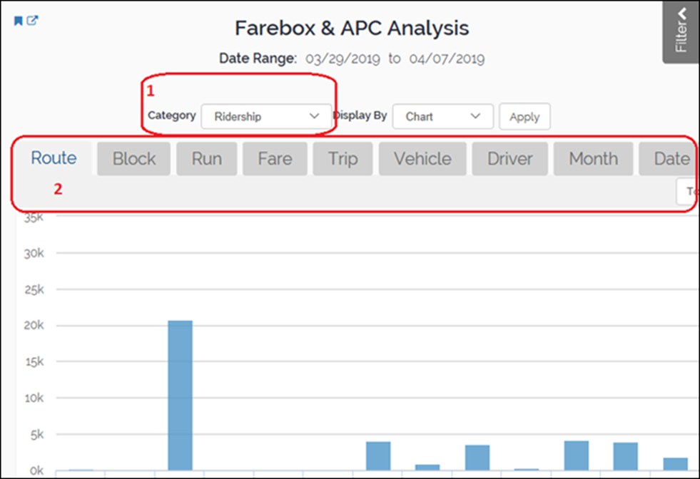
The drop-down list (1) allows you to choose the outcome variable that you want to assess. The values of this variable display along the vertical axis. In some reports, this drop-down does not exist and you choose the outcome variable by choosing the correct report from the menu across the top of the BI screen. After you choose the outcome variable, you need to decide how to display it using the tabs.
The tabs (2) allow you to choose the variable to display on the horizontal axis. These variables represent both categorical grouping variables and continuous time variables. If you choose a categorical grouping variable, the chart displays the outcome variable broken down by those groups. For example, you might choose to display ridership counts by Route, Block, Run, Fare, etc.
If you choose a categorical grouping variable, BI displays a bar chart, as shown above. On the other hand, if you choose Date or Minute, BI displays a line chart because it treats those variables as continuous values over time rather than groups. The next several sections discuss the properties of bar charts and line charts.
Bar Chart Functionality
Avail’s Business Intelligence uses bar charts when the horizontal axis represents a categorical grouping variable. Categorical variables break the observations down into a fixed number of mutually exclusive categories or groups.
Bar charts allow you to track outcome variables by groups in your data. Common categorical variables include routes, blocks, stops, operators, and so on. Each bar represents one value of the categorical variable. For example, if your categories are based on routes, each bar represents a route.
These categorical variables represent different paths you can take in drilling down and filtering the data.
Bar charts display an outcome variable that you are interested in on the vertical axis. Common outcome variables include ridership counts, farebox valuation, pullout status, and on-time status. The appearance of the bar chart depends on the nature of the outcome variable.
When the outcome variable is also a categorical grouping variable, each bar contains different colors to represent the percentages for different groups in the data. Consequently, the vertical axis is the percentage from 0 to 100%. For example, on-time status is a categorical outcome variable that contains the following groups: On-time, Late, and Early.
These charts allow you to compare percentages of subgroups in the outcome variable between the groups on the horizontal axis. Use this type of chart to answer questions such as, “Does on- time status vary by route?”
In the example below, the bar chart displays the pullout status by route. Pullout status is a categorical variable that includes the following groups: on-time, late, early, etc. Each bar represents one route. The colors represent the proportions of the pullout statuses for each route. The height of the multicolored portions of each bar represents the percentage a group comprises of the whole. Hover the pointer over a color to see the exact percentage for that route. The legend at the bottom identifies the group that each color represents.
To create this graph, go to Planning > Pullout-Pullin > Pullout-Pullin Analysis.

On the other hand, when the outcome variable is numeric, the bars are a solid color because there are no groups within the data. Instead, the bars summarize the numeric data.
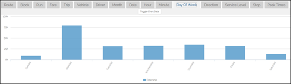
Consequently, the vertical axis represents values of the outcome you are assessing. In the example below, the bar chart displays the ridership counts by day of week. Each bar represents a day of the week. The height of the bar indicates the number of riders for that day. Hover the pointer over a bar to see the exact count for a day.
To create this graph, go to Planning > Ridership & APC > Farebox & APC Analysis, and then click the Day of Week tab.
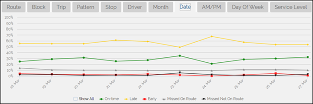
In the example below, the line chart displays the pullout status by date. Each line shows how the proportion of one status changes over time. Hover the pointer over a point to see the exact percentage of a status at a particular point in time.
To create this graph, go to Planning > Pullout-Pullin > Pullout-Pullin Analysis, and then click the Date tab.
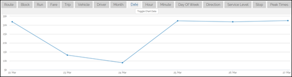
On the other hand, when the outcome variable is numeric, line plots display a single line because there are no groups within the outcome data. Instead, the line tracks the numeric data over time. In the example below, the line chart displays how ridership counts change over time. Each point represents a date. The height of the line on a date indicates the number of riders for that date. Hover the pointer over a bar to see the exact count for a particular date.
To create this graph, go to Planning > Ridership & APC > Farebox & APC Analysis
Line Chart Functionality
Avail’s Business Intelligence uses line charts when the horizontal axis represents dates or minutes. Line charts allow you to track the outcome variable over time.
Line charts display an outcome variable that you are interested in on the vertical axis. Common outcome variables include ridership counts, farebox valuation, pullout status, and on-time status. The appearance of the line chart depends on the nature of the outcome variable.
When the outcome variable is a categorical grouping variable, line charts display lines of different colors to represent each group. Each line represents the percentage for a group in the data and shows how it changes over time. Consequently, the vertical axis is the percentage from 0 to 100%. For example, on-time status is a categorical outcome variable that contains the following groups: On-time, Late, and Early.
These charts allow you to compare percentages of subgroups in the outcome variable between the groups on the horizontal axis. Use this type of chart to answer questions such as, “Does on-time status change over time?”
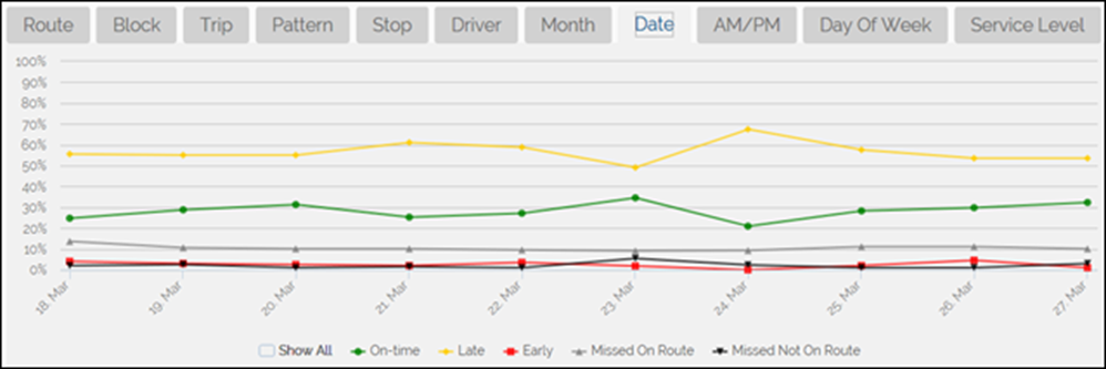
In the example below, the line chart displays the pullout status by date. Each line shows how the proportion of one status changes over time. Hover the pointer over a point to see the exact percentage of a status at a particular point in time.
To create this graph, go to Planning > Pullout-Pullin > Pullout-Pullin Analysis, and then click the Date tab.
On the other hand, when the outcome variable is numeric, line plots display a single line because there are no groups within the outcome data. Instead, the line tracks the numeric data over time. In the example below, the line chart displays how ridership counts change over time. Each point represents a date. The height of the line on a date indicates the number of riders for that date. Hover the pointer over a bar to see the exact count for a particular date.
To create this graph, go to Planning > Ridership & APC > Farebox & APC Analysis

Miscellaneous Buttons
Avail’s Business Intelligence offers several features to make your life easier.
On some of the tabbed visualizations, such as Farebox & APC Analysis, click ![]() to view the data behind the visualization in a table format, as partially shown below for the ridership data. Click the button again to display the chart.
to view the data behind the visualization in a table format, as partially shown below for the ridership data. Click the button again to display the chart.

If you hover over an individual graph in an overview dashboard, the Get Image button appears, as shown below. Click the button to download a screenshot of that graph.
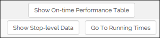
Other reports display buttons to access relevant data. For example, the following buttons appear below the On-Time Analysis Report.
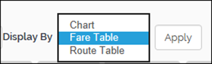
At the top of some tabbed visualizations, you will find different ways to present the results. For example, in the Ridership report, while Chart is the default choice, you can pick from the other options shown below.