The Events Queue Dashboard displays the number and type of events over the date range that the filter pane specifies. Use this dashboard to determine whether there are an unusual number of events, types of events, or a trend in events that can disrupt service.
Events are occurrences that myAvail displays in the Event, Communications, and Maintenance Queues. Examples of events that the system tracks include the following:
- Emergency Alarm
- Priority Request to Talk
- Request to Talk
- Message from Dispatch to Vehicle Failed
- Call to Vehicle Failed
- Late Logon Warning
- Transfer Connection in Jeopardy
- Message from Vehicle
- System Error Message
- System Warning Message
- System Informational Message
- Wheelchair lift event (several levels - Pass, Fail, and Skip)
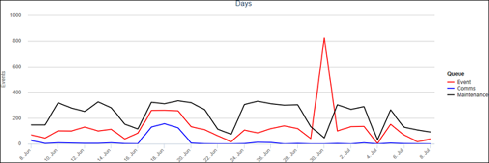
The line chart displays the number of events by queue: Event, Communications, and Maintenance. Use the line chart to assess the number of events and determine whether there is a trend or a spike in occurrences. For example, the chart below displays a spike in events.

Assess the pie charts to identify which types of events in each queue comprise the largest proportions of events. Each queue has its own pie chart. For example, the Communications Queue pie charts shows the proportions of the different types of communications events. At a glance, you can determine that RTT is the most common type of communication event.

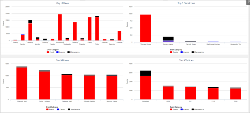
The bar charts display the number of events by different categories that appear along the horizontal axis. For example, assess the number of events by Day of Week, Top 5 Dispatchers, Top 5 Drivers, Top 5 Vehicles, and Hour of Day. BI color codes the bars by event queue, which allows you to see the proportion of events by queue for each group.

