This report graphically displays the drive times and layover/dwell times for trips both as they are scheduled and how they actually occur. Use this report to gain a “scheduler’s view” of running time variations for hooked trips and understanding how a particular trip can impact the performance of subsequent trips. Additionally, it helps you pinpoint problematic portions within trips.
To create the report, use the drop-down menu along the top to specify the Property, Dates, Route or Block, and Service Level. Then, click Apply to create the report.
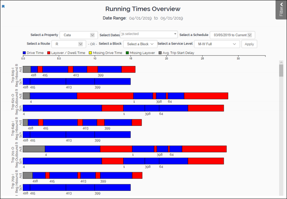
The horizontal axis displays the time in minutes. The longer the bars horizontally, the longer the duration of the entire trip. The numbers under the bars are stop ID numbers.
The vertical axis displays the different trips. For each trip, there is a pair of bars. The top bar displays the actual time while the bottom bar displays the scheduled time.
Each bar has color bands that represent drive time, dwell time, missing drive time, missing layover, and average trip start delay. Compare the two bars for each trip to identify portions where the actual times differ greatly from the scheduled times. These differences represent potential scheduling improvements.