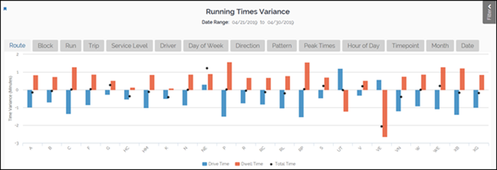
This report compares average actual performance to scheduled run times across all days, hours, and service levels for the date range that the filter pane specifies. Use this report to identify drive times, dwell times, and total times that differ greatly from the schedule times. Identifying routes with large differences can help target efforts to improve scheduling and on- time performance.

The outcome variable on the vertical axis is the average difference in minutes between the actual times and the scheduled times. Bars that extend below zero indicate that the actual times are shorter on average than the scheduled times. Bars that extend above zero indicate that the actual times are longer on average than the scheduled times.
Blue bars represent drive times. Red bars represent dwell times. The dots represent the total time. Ideally the total time dot centers on zero with drive time slightly below zero and dwell time slightly above zero.
The default graph displays running time variances by routes. However, click the tabs along the top to change the horizontal variable. For example, click the Block tab to view variances by block rather than route.
Use the filter and drill-down features to customize the report for your requirements. To learn how to interact with reports, see this Business Intelligence section.