This report displays the scheduled running times and speeds for the trips, their actual average running times, the minimum and maximum running times, and actual speed. Use this report to identify trips that have actual running times that differ greatly from the scheduled running times or vary widely between the minimum and maximum times. Identifying routes with large differences can help target efforts to improve scheduling and on-time performance.
To create the report, use the drop-down menu along the top to specify the Property, Dates, and Route or Block. Then, click Apply to create the tabular report.
For best results, filter the data down to a specific area of focus. Using the filter pane, you can filter by schedule, service level, trip, and pattern. When you do not filter the data, the table can provide an overwhelming amount of data.
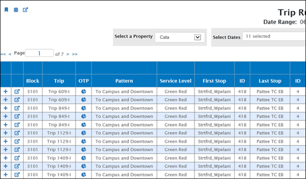
The left half of the table displays information about the trips including Block, Trip, Pattern, Service Level, First Stop and Last Stop.

The right half of the table displays information about the running times. Specifically, the table displays the scheduled, average, minimum, and maximum running times for each trip. Running times are broken down into Drive Time, Layover, Total, and Speed.

Click a column heading to sort the table by that column. Multiple clicks will toggle between ascending and descending sort.
Click  in the first column to expand the details for a particular trip.

Click  to display the Timepoint Running Times table for a specific trip. This table allows you to examine the timepoints within the trip to more precisely identify the source of a problem.

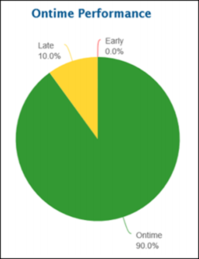
Click  in the OTP column to display a pie chart of the on-time performance for a specific trip.
