Use this report to identify routes and trips that use the greatest percentage of their capacity and are overcapacity the most frequently.
When Business Intelligence first displays the report, the top graph and the three tables display information for the routes and trips with the highest average utilization.
Click a route in any table to recreate this report so it focuses the graph and tables on only the route you clicked.
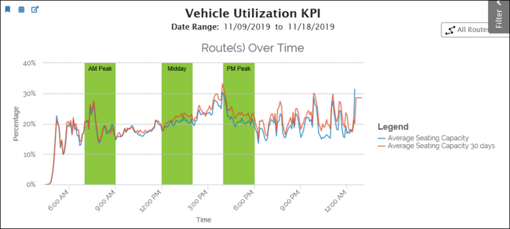
The Vehicle Utilization KPI graph tracks average vehicle utilization over both the date range that the filter pane specifies and for the past 30 days. Look for differences between the two lines to determine whether the average utilization has changed. Increasing gaps between the lines might require scheduling or vehicle changes.

The report also includes three tables that help you identify routes and trips where riders use the greatest percentage of the capacity. This series of tables display overall average capacities by route, peak time capacities by route, and average capacities by trip. By assessing capacity usage by peak versus non-peak, and route versus trips, you can identify specific times and/or trip directions that are experiencing problems even when the overall average picture looks good.
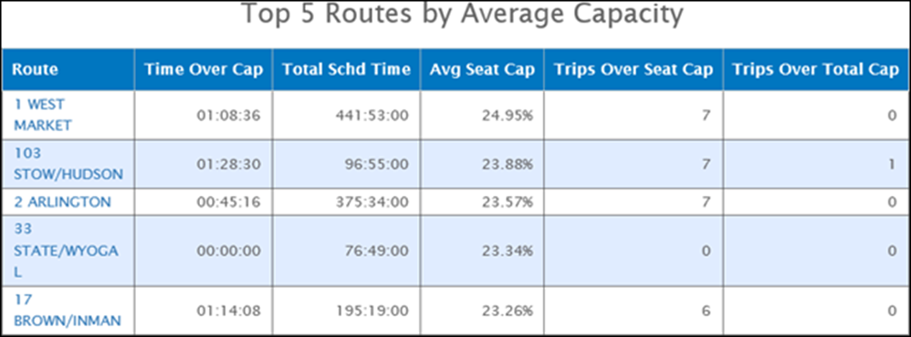
The top table displays the top five routes by average capacity over the entire date range that the filter pane specifies. Use this table to find routes that are overcapacity the most frequently using the follow three metrics:
- Running time over capacity.
- Number of trips over seating capacity.
- Number of trips over total capacity.

The second table displays the top five routes by average capacity during peak time over the date range that the filter pane specifies. This table displays the same capacity metrics as the previous table. It helps you find routes that are overcapacity during peak times specifically. These routes might not have an overcapacity problem during the rest of the day but experiences them only at peak times.

The third table is like the first two. However, it displays average capacity statistics by trips. This table allows you to identify trips with capacity shortages even when the route as whole does not have capacity problems. For example, the outbound trip might use more capacity than the inbound trip.

For all the vehicle utilization reports, use the filter pane to filter the results by route, block, vehicle, direction, peak time, workday type, and day of week. These filters help you identify the source of utilization problems. Additionally, use the following specialized outlier filters to exclude potentially anomalous reports:
- Include Outliers: Check this box include to include anomalous utilization reports from vehicles. When this box is unchecked, the reports exclude vehicle utilization that exceeds the outlier By default, the reports exclude outliers.
- Outlier threshold is: Enter a value to specify a multiple of total capacity that represents an outlier that you can exclude from reporting. When vehicle utilization exceeds this value, it will not be included in reporting by default. Lower values will include more results when you check the Include Outliers box. The default value is 2 times maximum vehicle capacity.